On Disabled Space, and art
2024-07-11
 Followers of the site, might have noticed a dramatic change in the last few days. I recently decided to end what has been my longest standing art project to date. By switching the site's base font from open dyslexic to Atkinson hyper legible.

To me it looks like all letters suddenly got a back brace, or a botox injection. Poor letters no one lets them slouch. open dyslexic was an intentional design choice on my part, one of several actually all to create a particular effect.
a software artist's dream
if you'll note on the front page of my website, I described myself as a software artist. Not a software engineer, not a software scientist, heaven forbid a content creator, but a software artist. I have held all of the former titles I mentioned. These have only been jobs, what I aspire to be is an artist who uses code as a medium. So on this website I have declared myself to be one, and seek to act as one.
what does the "software artist", do that is different from the engineer or the scientist. Well this is naturally subjective, but my interpretation is that while the engineer, or the scientist seeks only code that is fit for is intended purpose, and in so far as possible code that is free of defects.
The artist regardless of medium, will seek to reflect the individual or society to itself, while occasionally when circumstances warrant criticizing culture and society.
In practical code terms this means several things
- I have often kept bugs in code, if they serve some aesthetic purpose. When they have I call them unintended design elements.
- I generally approach programming as an endeavor not to be taken to seriously. And in my artistic code generally ashew fads like automated testing and so forth, and plain old python is almost always a better tool for what I do than rust. Although I am capable of using both if the situation should call for it.
- The message of the art often has priority over the function of the code.
It is this third point that I think is worth expanding on a little. Especially in the context of the end of my longest running stealth public art project, this website.
To the untrained this website looks like a bog standard, developer portfolio and blog site. And indeed this is how it started. But when I switched my internet identity from "Matt Arnold" to "Pius Q Bird" a few years back I wanted an intentionally different website design. Even though everyone knows my secret identity so to speak.
And so this website has gone through several iterations over the past four years. Including one where and I kid you not I developed a novel crypto system, for the purpose of posting to my blog. Just because I hated logging in. That iteration lasted all of about three months before I had a brainwave, and decided that exposing a novel crypto system to the public internet, was not the best idea.
The current design is version 4 or five I think. Runs on the zola static site generator, and a spaghetti mess of custom javascript. with this design I saw the opportunity to do several things. First to get Xe Iaso style conversational interactions into the blog finally.

The second thing I saw an opportunity to do was to experiment with constructing disabled space, in a website form.
what is disabled space?

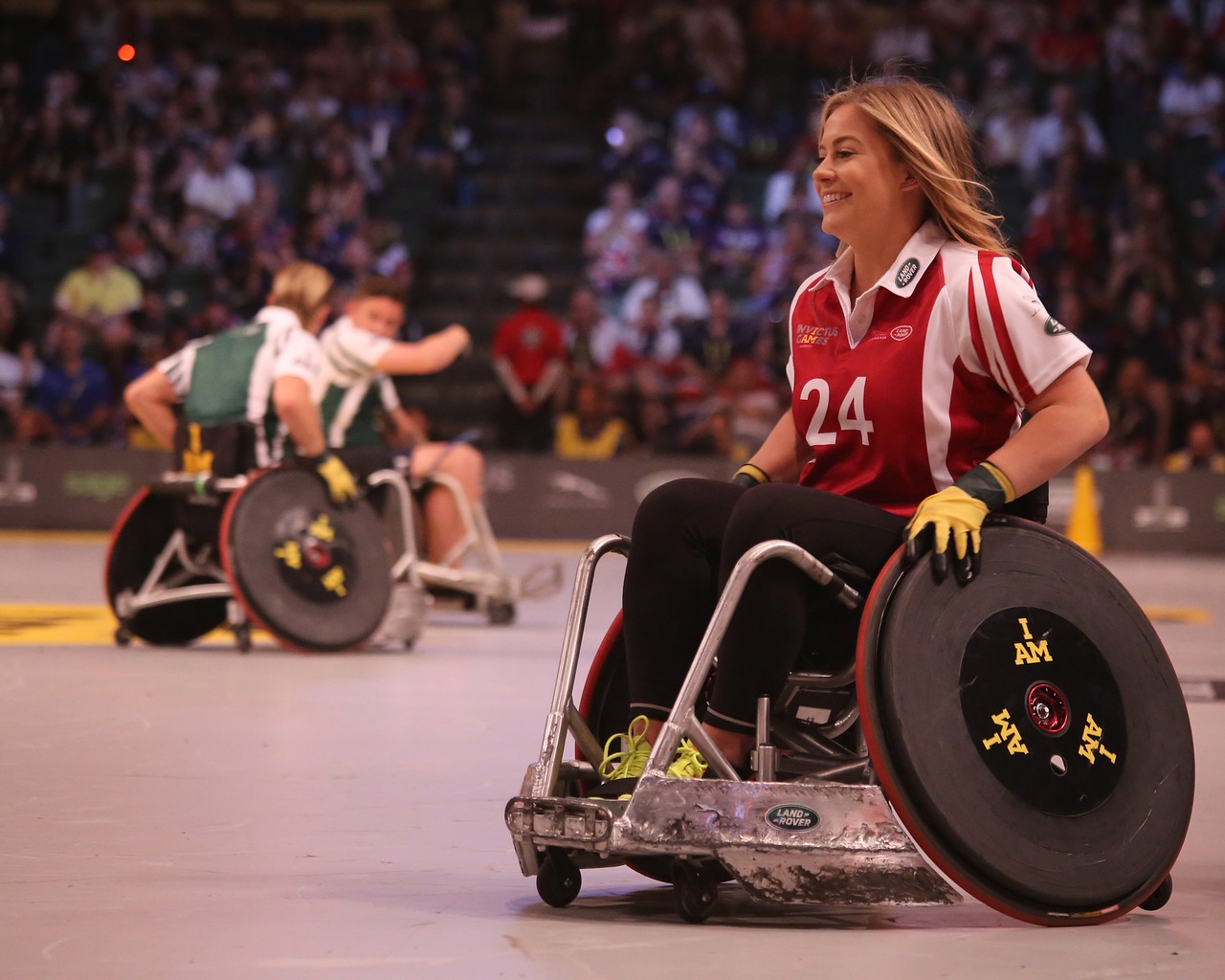
disabled space is space which is specifically constructed with the needs of persons with disabilities as paramount consideration. As opposed to accessibility which merely retrofits accommodations for the disabled onto existing space. Precious few public examples of disabled space exist. Such construction is usually reserved to private homes, or semi private institutional spaces, where the institution itself is run by the community itself.
The reaction of able bodied people to existing in this space is usually one of discomfort, they might be uncomfortable cooking in a kitchen where everything is at wheelchair height for example. Or they may not get to significance of the stoplight system for social interaction. this reaction, is but a little taste of the discomfort, pain and alienation that the disabled community feels everyday. When trying to navigate space designed for typical people.
I decided with this latest version, to construct my website as disabled space. And see what happened. The results were not entirely surprising but still shocking in their way.
The design
the design of the website was not too difficult, originally I made it intentionally broken on mobile. This was to give people a taste of what navigating the mobile web is like for me. I had to put a stop to that of the project rather quickly. Because I got comments from a social worker, in an official capacity that I was not competent as a web designer. And for my safety I had to make it mobile accessible.
Open dyslexic as the most visible element of the design, I used it as the base font for everything. If it could not be loaded I would default to comic sans, and failing that to a monospace font. Other than that finding aesthetically pleasing color contrast that were WCAG compliant was not too difficult. And making the text extra large was just a CSS property.
The reaction
People just did not get the point, which I expected. What I did not expect was the remarks, that my "professional website" should not look this way. This is not a professional website. Despite it being mentioned on my resume for some damned reason. If employers see it and choose not to offer me a job. well then they've shown themselves to have views that would potentially be problematic for a disabled person in the workplace. I even got several suggestions that I should make two websites, if I wanted to keep the look. These were just the concerned reactions. From people who I like, from people who want me to thrive.
The hostile reactions, and the entitled ones were something else altogether. In disabled space in the physical world, people feel discomfort, people are unfamiliar with the etiquette. And are wrong footed by it. However there is recognition that, having such space for people to live, or work in is necessary.
Whereas able bodied people think the internet should just conform to them no matter what, and to do anything else is incompetence is best and malice at worst. I've already explicitly stated having to censor the broken mobile aspect of the design. Because a job coach thought I might be incompetent. But you would not believe the volume of comments I got citing studies that open dyslexic did not increase reading speed and that was therefore useless. As if one single study, with methodological flaws, badly premised . Should have authority over what I do on my website.
What I found most interesting however was the suggestion that I make two websites if I wanted to keep look, one to show potential employers and one to keep to myself. I might indeed do this at some point later. But I found the endorsement of a form of masking, even among within the disabled community, to be somewhat amusing.
Conclusion
I have now declared this art project, mostly complete. As I said I switched the font from Open Dyslexic, to Atkinson hyper Legible. In an effort to keep the accessibility properties of the website, while making it look more professionally palatable. It'll switch back automatically on certain days of the year. The typography has unionized, and I'm now forced to give it regular rest. Which days is left as an exercise for the reader. There is currently only one, but it's coming up. And more will be added over the course of time.
Have Thoughts?
Do you have comments on one of my posts? I would love to hear from you. Please send email to my public inbox. Or Toot at me over on Mastodon. I'm @piusbird@tilde.zone
Copyright © 2025 Matt Arnold CC-NC-BY-SA 4.0